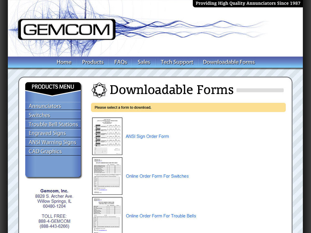
Gemcom had a very outdated website, so this was a complete overhaul. They already had business cards made up with the wavy blue graphic seen behind the logo, so I incorporated it into the site. I modified their logo slightly, giving it a bit more personality, but keeping it recognizable and simple.
The page content was rethought and condensed into fewer pages, making it easier to find the relevant information. Since the new code was written from scratch, it is much more optimized for search engines.
www.gemcom.com
Type of Site: Online Store

