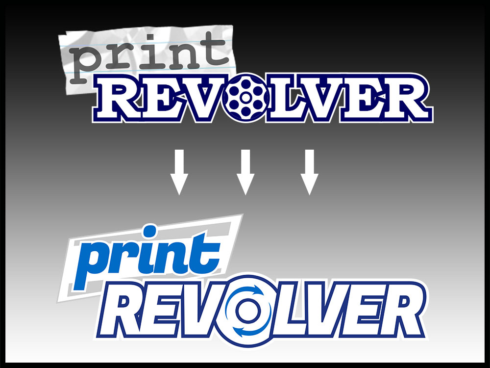
I started printRevolver back in 2008, and felt it was time to refresh the site with a new look, and a new logo! Rebranding is important to get right. I wanted to keep some of the same elements from the old logo so the new one wouldn’t be totally unrecognizable. As you can see, I kept the same basic layout, but used a new font. I updated the “paper” background to a sleek, stylized version, and added some color to the text. The “O” was also updated to a new style.
I went through many variations, with different colors and sizes, slanted text, and so on. I’m pretty happy with the final version. The new site uses the same colors as the logo, and has many new features (one of which is this blog). As I’ve gotten more and more into photography, I wanted a place to post photos other than my portfolio, which I want to keep slimmed down to representative samples.